

Anyone can appreciate this.
/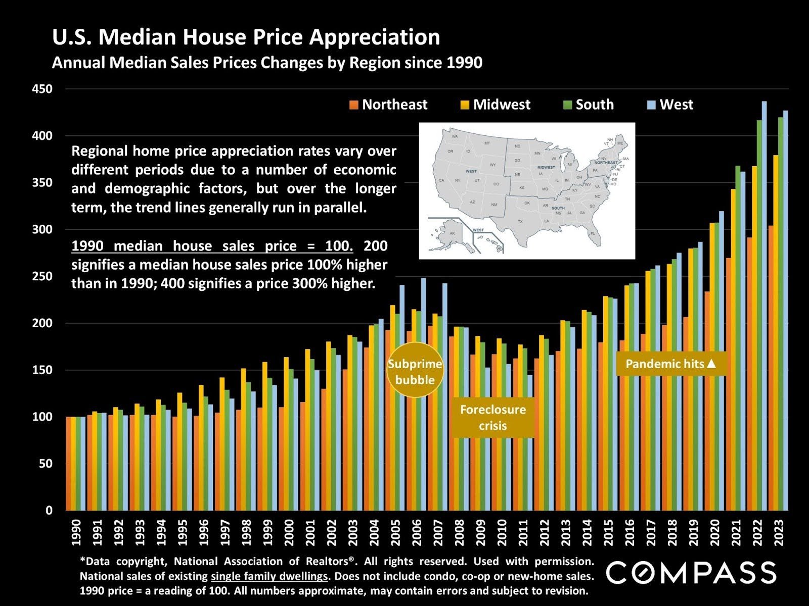
If you ever needed a visualization of the rising cost of homeownership, this chart should do the trick. Tracking median house sales price fluctuations by region since 1990, you can see a significant shift to the West and South and away from the Northeast, even as prices have appreciated across the country. Of course, the last spikes we saw in western sales led to the subprime bubble, so it’s good for investors to be cautious.
